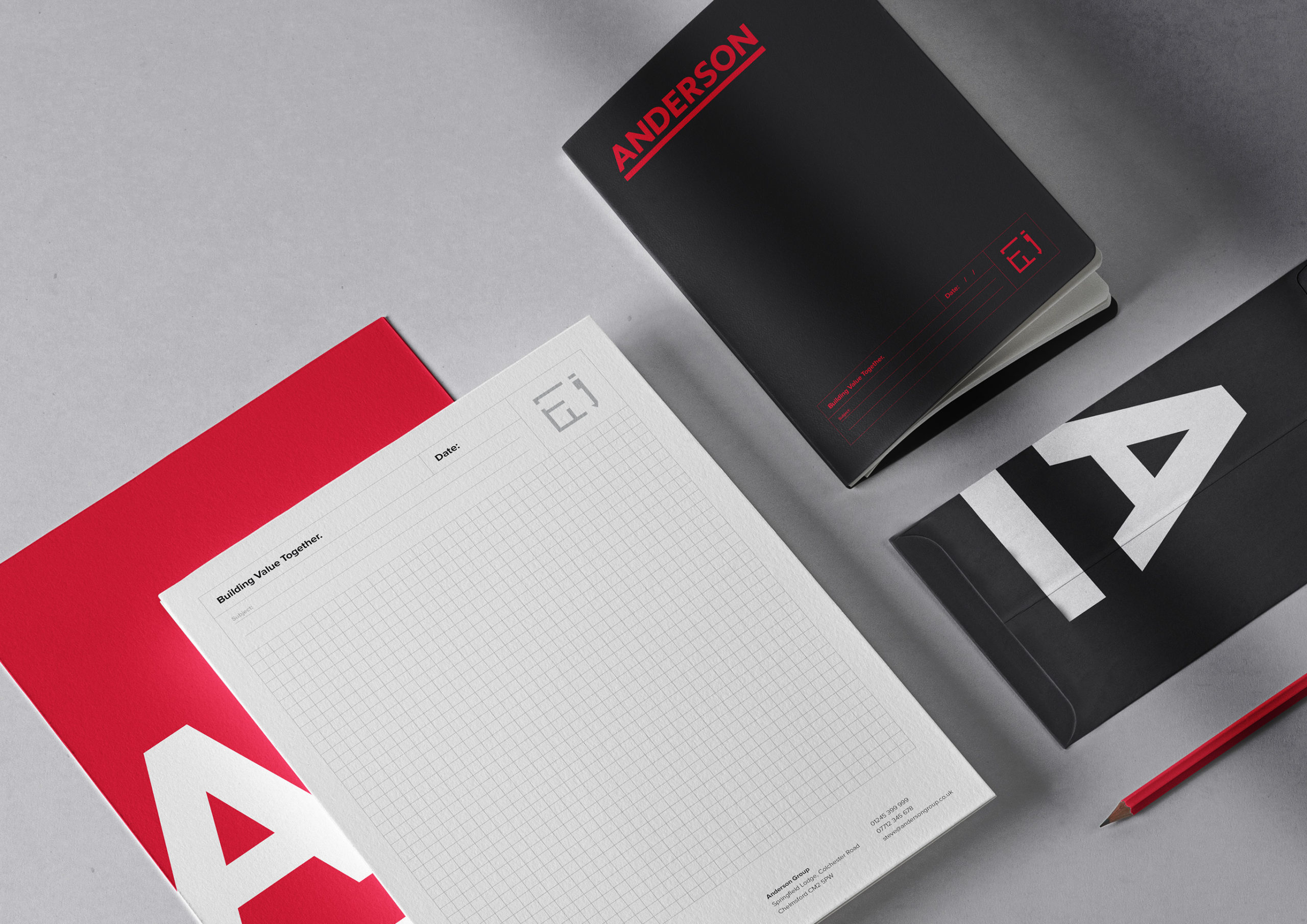
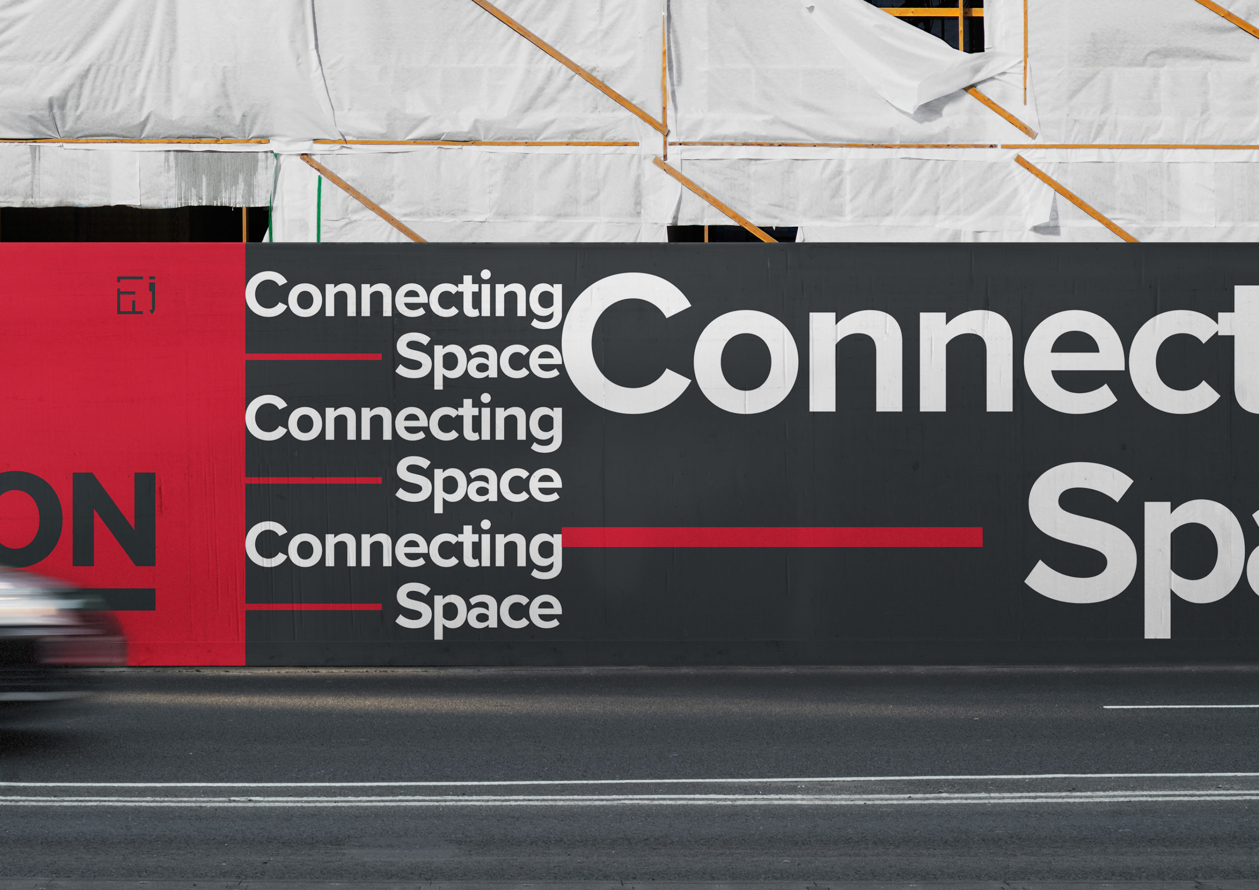
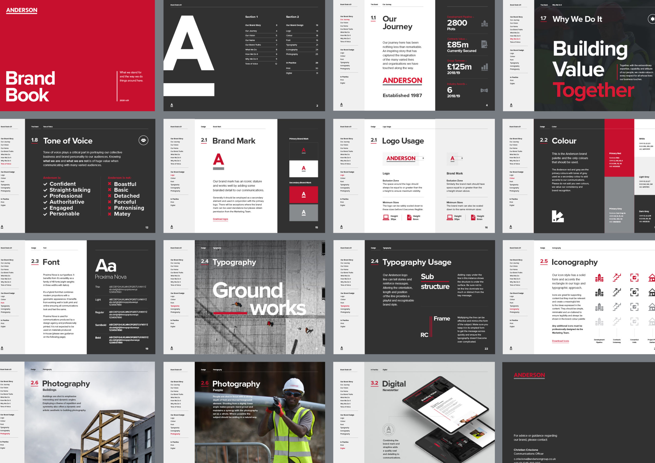
Anderson is a national construction company that values who they are and collaboration. Temple was commissioned to evolve their existing brand, however; retain a clear connection to their current brand.
Our solution was to expand on the usage of the underline in their logo, exploring its relationship with the wider brand system. The inclusion of the line with typography and an iconic word mark created a design language with flexibility and personality.
Contributors
Strategy: y?
Copywriting: Volcano